Sunday, August 30, 2015

OPI Venice Collection Haul/Review

So the next fall collection I have to review is the OPI Venice collection for fall 2015. 


The first polish and probably the most popular is called Gelato On My Mind. This is another classic bright powder blue. This also happens to be a spot on dupe for Essie Mint Candy Apple. This polish has a great formula, as usual; it is smooth and very opaque.The picture below has two coats. 
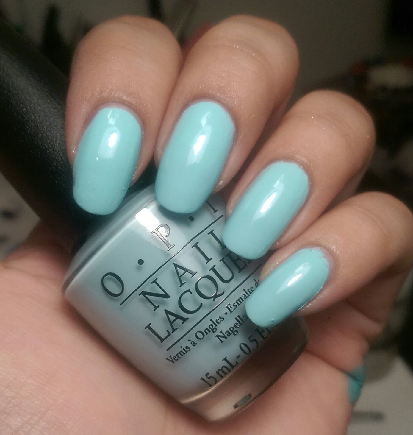

The picture below shows comparison between Gelato On Y Mind (thumb) and Essie Mint Candy Apple(pointer), China Glaze For Audrey (middle), Julie G Gelato in Venice (ring), and Sally Hansen Breezy Blue (pinky). 


The next polish is my favorite creme of the collection and it's called It's A Piazza Cake. This is a fantastic burnt orange shade. It is super smooth and super opaque. I was pleasantly surprised that this color looked great against my skin tone. Normally oranges of that tone don't look that great on me, but this looks really nice on my nails. 


The next color is called Worth A Pretty Penne . This is a light rose gold shimmer polish. It is slightly streaky but still has very excellent coverage. 


Next polish is called Give Me A Lido Kiss. This is a bright blue toned shimmery red. The shimmer almost looks like a glass flecks. This also has good coverage although the base reminds me of a jelly polish.


Macro shot of OPI Gimme A Lido Kiss


 This next polish is called My Gondola Or Yours? This is a deep smoky black with very subtle shimmer. A lot of people or referring to this as a gunmetal shade, but to me it is just a black with shimmer. Not super unique, but I think I'm due a new black .Picture below is with flash to capture the shimmers.


The next polish is the first of 3 limited edition polishes from this collection. I wasn't able to find these at Sally's Beauty Supply and Ulta did not have them when I first initially looked. So I bought them online on Amazon. 

The first polish is called St. Mark's The Spot. This is a beautiful royal sapphire blue shimmer with a slight purple shift. This color is wonderfully opaque and striking on the nail. 


Shot from direct sunlight.


Shot from indoor lighting.


Shot with flash.


The next color is called Venice the Party? This is a bright aqua blue/teal shimmer. This color is a tiny bit streaky and shows brush strokes but it's still a fabulous color. 

Both of these blue shimmers are similar to something we've seen from the OPI Hawaii collection, so they weren't as much of a stand out to me initially. The colors are still really gorgeous though!


Shot with indoor lighting. 
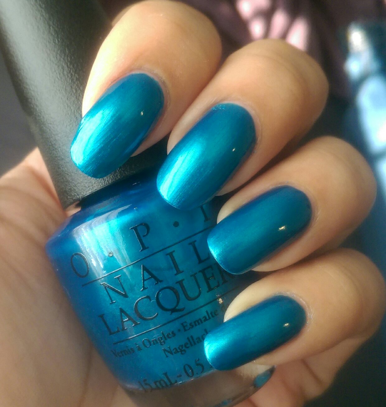

Shot from direct sunlight.


The last color however is very unique and eye popping. Its called Baroque...But Still Shopping! This is by far my favorite of the entire collection this is a greeny silver with gold shards and gold glitters. This literally looks like shredded up money. When I was younger I went on a field trip to Washington DC and got to see the Treasury. They sold bottles full of old shredded money that had been taken out of circulation. The effects of this polish make it look like that bottle of money. This polish does dry to a gritty texture so you will need to have a top coat over if you don't like the gritty texture. 

 Shot from indirect sunlight.


Macro shot. 


Shot from indoor lighting.


Overall, I think this is a very elegant collection from OPI. I highly recommend the 3 limited edition polishes! And also It's A Piazza Cake!


Tuesday, July 7, 2015

Nail Medic CC Cream Laquer Review

This first impression blog post doesn't need very many words, the pictures can do all the talking.
But here's a little background:

Like all nail polish addicts, my nails have become badly stained - some worse than others. Thanks to China Glaze But of Corpse, my right thumb has been in pretty bad shape. It's grown out some, but the yellow is still very prominent. Sometimes I just want to let my nails go naked in public, but I'm always embarrassed that the yellow is too noticeable. So I was doing my normal scope-out at Wal-mart - and I have to say, they are really doing a great job of stepping up their nail care section! They now have this nail treatment brand called Nail Medic. I think the parent company is called Pretty Woman. they have complete step-by-step nail treatments to nurse damaged nails back to health. So i decided to try some out. I'm always in the market for new base coats, so I picked one out of the several options available. I chose the CC Cream Color Correcting Base. On the box, it claims to "instantly whiten & brighten nails" while treating them with green tea extracts and vitamin E.

As with all new things, I like to go in with little to no expectation. At the most, I just thought it would be a patchy clear coat. But man, new things are really working out for me lately! This turned out sooooo much better than I expected!

It made my nail beds whiter and it basically neutralized the yellow on the tips. It looked even better after I applied the second coat. You can even see in the photo that the yellow is virtually gone from my right thumb! This was so exciting to see!


So after it passed the inital first impression test, it was time for the wear test! After I applied the base, I worked on an ombre nail art  (more on my ombre adventures soon!) After a week, this wore so well. normally, I will pick at my nails and seek out weak spots to chip or peel off, but with this base coat, there were none! I had no tip wear or chips after a week of wear! This never happens to me! I didn't do anything special with my topcoat; I just used my normal Seche Vite topcoat. 


The two pictures above from fresh mani to a week later. 


So, I would highly recommend this base coat for anyone in the market to try something new. I would expecially recommend it to anyone trying to neutralize yellow stains on their nails. I have used it for two weeks now, so only time will tell if it has any long-term benefits!


New Colour Prevails Nail Polish First Impression

I was wandering around Walgreens one day when I came across some shiny new displays where you would normally expect the Jordana/Sinful Colors to be located. They were for two new makeup collections! Of course - I immediately scope out the nail polish! I can't remember the name of the first collection (they didn't have nail polish, hehe) but the other one was Colour Prevails - definitely more eye-catching! The display seems to have an entire line of makeup, but I was definitely on the look-out for nail polish! I am always pretty apprehensive about scooping up new polish lines, and sometimes over-the-top packaging seems like more of a gimmick to make up for poor formulas - in my opinion. That doesn't mean I'm not a sucker for packaging! So I picked out one bottle. I figured if it sucked I could still keep it for the packaging. I went for the most unique-looking color in the display...


This is Blue Blood. It is a deep blue/sapphire shade with blue and teal shimmers in it. The coverage is actually really good. It could be opaque in one coat! The shimmer is super subtle on the nail - you can only see it in direct sunlight. It is definitely more prominent in the bottle.


I was super impressed by the formula of the polish (it pays to have low expectations)! So, naturally I had to know more about this company, like:

What kind of company is this?

                                    How old are they?

                                                           Why did they choose the drug store market?

How does a new company charge $8 for a bottle of polish with little to no advertising?

What makes them think they can enter the market and already be on par with the likes of Essie, OPI, and other high end but available in drugstore brands?

I just needed to know...the business major in me came out to investigate. So I did some digging and it turns out that the brand is headed up by Nonie Creme - former founding Creative Director for butter London! Then I promptly took several seats. Lol.


So Nonie has broken out on her own and brought her creative genius to Walgreens everywhere! The main product's claim to fame is the ergonomic handle on most of the products adorned with a beautiful butterfly wing! This puppy is definitely not just for looks, either. It is meant to give you a steady hand and therefore more accurate application of makeup or nail polish. It did give me a steadier hand to paint my nails neater, but it was no miracle worker - my left-hand painting is still atrocious!


Overall, it is a very decent polish, and the packaging is beyond beautiful. But the price point is what gets me. Paying $8 is pretty pricey for a drugstore polish. Why pay that when you could pay the same for an Essie or China Glaze polish? Or pay a little extra and get an OPI polish? I don't think they brand has enough pull for people to buy just for its exclusivity just yet. The colors in the rest of the collection aren't much different from other brand either. However, I will be keeping my eye on this company - especially with Nonie Creme at the helm! There are bound to be some great things coming from this brand!


More shots of the shimmery goodness of Blue Blood below! 


Tuesday, May 5, 2015

New Julie G NEW Core Collection Shades!

While at Rite Aid, I also got a hold of the new shades Julie G has released from the core collection. There are 9 new beautiful shades! First impression of these is that they all are very Zoya-esque! Meaning that they are super shimmery, glittery, and have amazing formulas! After I started swatching, I found 3 that could serve as Zoya dupes! I'll have those pictures up after the initial swatches!

Julie G Core polishes from L to R: Obsessed, #nailsoftheday, Molten Lava, Supervillian, 
Poker Teal-er, Brady Bear, More Karats Please, Albuquerque, Pin-up Girl


This first polish is called Pin-Up Girl. It is a satin-y/metallic fuschia. The formula is pretty smooth and it applies evenly. It is a little thin, but it is buildable. (Shout out to my Cinderella hand for being decent enough to swatch on! hehe)


This polish is called Albuquerque. This is a bright orange with a golden shimmer. The formula is great - it is very smooth and easy to apply. This swatch in the photo is two coats. The nail line is still pretty visible, but I believe it can be built up. The shimmer in the sunlight is unbelieveable! 


This polish is absolutely fantastic! I didn't get too worked up on this polish initially. I figured it would be like a gold "topper" but I literally gasped when a applied this to my nail - no lie! I was completely blown away. This gold is spectacular! It's a more yellow gold than any gold that I have in my collection. The formula is solid it's completely opaque in 2 coats. I think it has one of the best formulas of this whole batch. Oh yeah, the name is More Karats Please. <drools>


The next polish is #nailsoftheday. This is a plum with gold shimmer. I think this formula was a little tricky - it ended up getting a little gloopy on my middle finger, but it smoothed out just fine. The plummy base also has a little black in it which gives it a lot more depth. Again - very Zoya-esue with the formula. It reminds me of something that was in the Zoya fall collection - India maybe? I don't have it to compare to though, so...:(


This polish is called Molten Lava. It has the same formula as #nailsoftheday, but this is a medium berry base color. It has the same beautiful golden shimmer and extra dimension. This one may be pretty close to Zoya Teigen. 


The next polish is called Supervillian. This is a sultry red with golden shimmer. This has a great formula like all the other polishes. It is a great red with dimension and depth. This is probably a dupe for a Zoya polish, but it's another one I don't have in my collection. :(


Next is Brady Bear - affectionately named after her sweet doggie Brady! This is a beautiful bright blue with golden shimmer. It is so much brighter than what it looks like in the bottle! It was almost as exciting as More Karats Please!


This is a shot of what it looks like indoors. Still a very striking blue!


I did manage to go through my Zoya collection and find something I thought was similar - and it was the much praised and much talked about Remy. Remy is such a beautiful pigmented blue. Brady Bear is just slightly lighter and brighter. It is also a lot more pigmented. The swatch is 2 coats of Remy and 3 coats of Brady bear. Both are absolutely beautiful though! 


Pictured on the pointer and ring finger: Zoya Remy. On the middle and pinky finger: Julie G Brady Bear


Just look at the shimmer on both of these polishes!! Ugh. Beautiful!! (Zoya Remy on pointer and ring. Julie G Brady Bear on middle and pinky)


This next polish is a shimmery teal dream! This is called Poker Teal-er. It has the usual amazing formula! It is a bright teal with a golden shimmer. The swatch above is in sunlight, and the below swatch is indoor lighting. Two coats will get you opaque with this one.


This polish happens to be a dead-on dupe for another Zoya polish! This is a dupe for Charla. Charla is one of the first Zoya polishes I ever bought and I love it so much! You can look at the side by side comparison below. They both have the same teal tone and shimmer.


Zoya Charla is on the pointer and ring finger and Julie G Poker Teal-er on the middle and pinky finger. This is a shot in the sunlight.  


 Here is a swatch in indoor lighting. Zoya Charla on the pointer and ring, Julie G Poker Teal-er is on the middle and pinky finger.


Last but definitely not least, Obsessed. This is a deep smoky purple with golden shimmer. It is absolutely a stunner! The shimmer just looks awesome against the dark purple!


This is a shot of Obsessed in direct sunlight.


 And once again, Obsessed is a dupe for another polish in the Zoya Ignite collection - Sansa. This is the only one that is an EXACT match - down to the way the formula applies! None of the other two were as close as these two! I get so excited when I find dupes like this! Especially for colors that are as dynamic and unique as Zoya!


Bottle shot of Julie G Obsessed and Zoya Sansa


Sunlight shot of Zoya Sansa on pointer and ring finger, Julie G Obsessed on middle and pinky,


Close-up shot of Zoya Sansa (top) and Julie G Obsessed (bottom)


Shade/indoor lighting shot. Zoya Sansa on pointer and ring finger, Julie G obsessed on middle and pinky.


This entire group of new polishes is spectacular! I always get excited for new Julie G polishes, but these were unlike anything that's ever been released from her! Overall, the formulas were consistently good - and very comparable to Zoya polishes. Some I didn't have to compare to, but they share the same glass fleck characteristics of the Ignite collection. So if you are looking for a cheaper alternative to Zoya, here you go!

Standouts for me are definitely More Karats Please and Brady Bear hands down! 

 Dupes for Zoya!